In 2015 I wrote about Cas9 stuff:
http://qmviews.blogspot.com/2015/09/literature-004-jinek-et-al-elife-2013.html
In the last part, I mentioned very early experiements remotely related to humans. There were problems and most importantly, there was consensus among the scientific community that the technology should be handled with care and ethics in mind.
None of that did prevent what happend. The guy from Standford did it. How come he wanted to do it? Why did the system fail to deliver ethical values to this guy? Why was the desire to be recognized, famous and prominent so much stronger than the respect for the ethics? Dont give me the medical reasons. There're just not credible here.
In any case, we lost. The dam broke, the box is open. It feels hopeless. The only thing that's left is to feel sorry for these two kids. And for us.
Montag, 26. November 2018
Freitag, 4. August 2017

Samstag, 18. März 2017
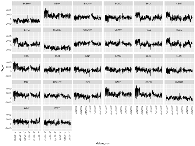
Open Traffic Data: Visualizing Cumulative Daily Delay of Tram Line 10 in Zurich
First impression of visualizing the accumulated delay of tram line 10 in Zurich from late 2015 until end of January 2017 at every station of the line.
 The analysis is an early result of the open data hackathon earlier this month. To be continued...

Montag, 19. Dezember 2016
R: Clinical Trial Simulator
The first version of the clinical trial simulator is online now.
It uses a dose-response model based on the Hill equation which basically is a saturation model. The assumption is that a cell is covered by a finite number of receptors. When the treatment is applied, a fraction of the receptors (depending on the dosage) is interacting with the treatment molecule and every interaction leads to a response. When every receptor is binding to the treatment, the response saturates.
 It's based on the MSToolkit package and is hosted online at shiny apps under
https://mzhku.shinyapps.io/trialsim/
It uses a dose-response model based on the Hill equation which basically is a saturation model. The assumption is that a cell is covered by a finite number of receptors. When the treatment is applied, a fraction of the receptors (depending on the dosage) is interacting with the treatment molecule and every interaction leads to a response. When every receptor is binding to the treatment, the response saturates.

https://mzhku.shinyapps.io/trialsim/
Sonntag, 4. Dezember 2016
R: Sample Size Calculator
Given a beta, how many patients need to be enrolled in a two-armed study of conventional against experimental therapy? Significance is set to 0.05, recruitment period and follow-up period can be defined together with median disease free survival times for the two study groups (implemented in R/Shiny):
 Github repository
Try it (also mobile)!
https://mzhku.shinyapps.io/size/

Try it (also mobile)!
https://mzhku.shinyapps.io/size/
R Shiny: Some reactivity by example
Start R from the directory containing ui.r and server.r, import the shiny library and start the (development) server using runApp().
server.r
server.r
function(input, output) {
rv <- reactiveValues()
# Only modify and output reactive input
output$numOut1 <- renderText({
input$n+10
})
# Modify, reassign and output reactive input.
output$numOut2 <- renderText({
rv$a <- input$n+20
})
# Use modified reactive input, modify and output.
output$num1 <- renderText({
rv$s <- rv$a+runif(1)
})
# Assign reactive input locally, modify locally, print.
output$num2 <- renderText({
k <- input$n
paste(as.character(runif(1)), "here", k-10)
})
# Use reactive value from another reactive function,
# modify and print.
output$let <- renderText({
paste(as.character(rv$s), sample(letters, 1), sep="")
})
}
ui.r
fluidPage(
numericInput(inputId="n", "Shiny Reactivity Example", value=25),
textOutput(outputId="numOut1"),
textOutput(outputId="numOut2"),
textOutput(outputId="num1"),
textOutput(outputId="num2"),
textOutput(outputId="let")
)
Donnerstag, 18. August 2016
R: Plotting multiple categorical data
Frequently, values are plotted against a categorical argument. The categorical argument can be thought of something like a weekday label or a step in a specific technical procedure ("Step 1", "Step 2", ...). Of course, these arguments could be converted to a numeric value used for plotting and after plotting, one would overwrite the x-axis labels to get the categorical data on the axis. But if Excel can do it, then it should be possible to do it in R as well. Here's how.
The resulting figure looks like this:

The data in the example is from the book "Design and Analysis of Clinical Trials: Concepts and Methodologies" by Chow (full data set).
Here, the categorical data (x-axis) are five repeated measurements of diastolic blood pressure, denoted "DBP1", ..., "DBP5", where DBP1 is the baseline value. 40 subjects have been treated with either a hypertensive agent (A) or placebo (B). After averaging over treatment groups we end up with two groups we want to inspect.
> d <- aggregate(dat[, 3:7], by=list(TRT=dat$TRT), FUN=mean)
> d
TRT DBP1 DBP2 DBP3 DBP4 DBP5
1 A 116.55 113.5 110.70 106.25 101.35
2 B 116.75 115.2 114.05 112.45 111.95
TRT DBP1 DBP2 DBP3 DBP4 DBP5
1 A 116.55 113.5 110.70 106.25 101.35
2 B 116.75 115.2 114.05 112.45 111.95
How can now d be plotted to immediately make the difference between the treatments visible? Lattice can plot multiple data records (the A- and B-rows) against categorical data, but for that, the data has to be in long format. This can be generated using the melt function from the reshape2 package.
> m <- melt(d, id="TRT", measure.vars=colnames(d[, 2:ncol(d)]))
> m
TRT variable value
1 A DBP1 116.55
2 B DBP1 116.75
3 A DBP2 113.50
4 B DBP2 115.20
5 A DBP3 110.70
6 B DBP3 114.05
7 A DBP4 106.25
8 B DBP4 112.45
9 A DBP5 101.35
10 B DBP5 111.95
TRT variable value
1 A DBP1 116.55
2 B DBP1 116.75
3 A DBP2 113.50
4 B DBP2 115.20
5 A DBP3 110.70
6 B DBP3 114.05
7 A DBP4 106.25
8 B DBP4 112.45
9 A DBP5 101.35
10 B DBP5 111.95
The melted data.frame m can now be plotted.
> xyplot(m$value~m$variable, type="o", group=m$TRT, auto.key=list(T))
The resulting figure looks like this:

Abonnieren
Posts (Atom)